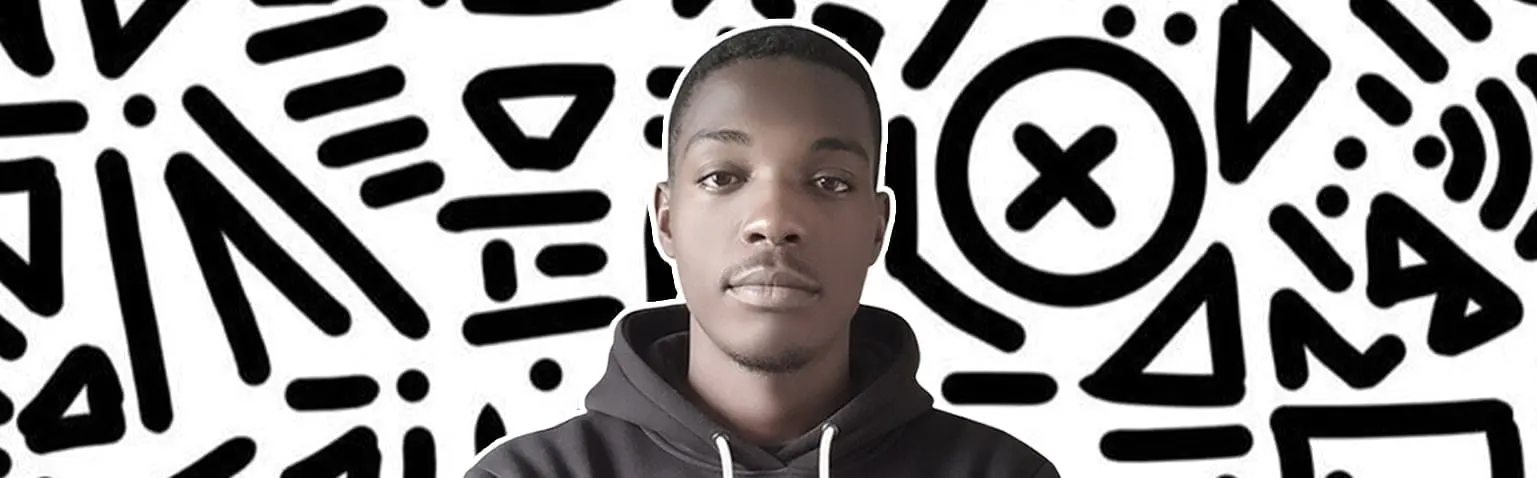
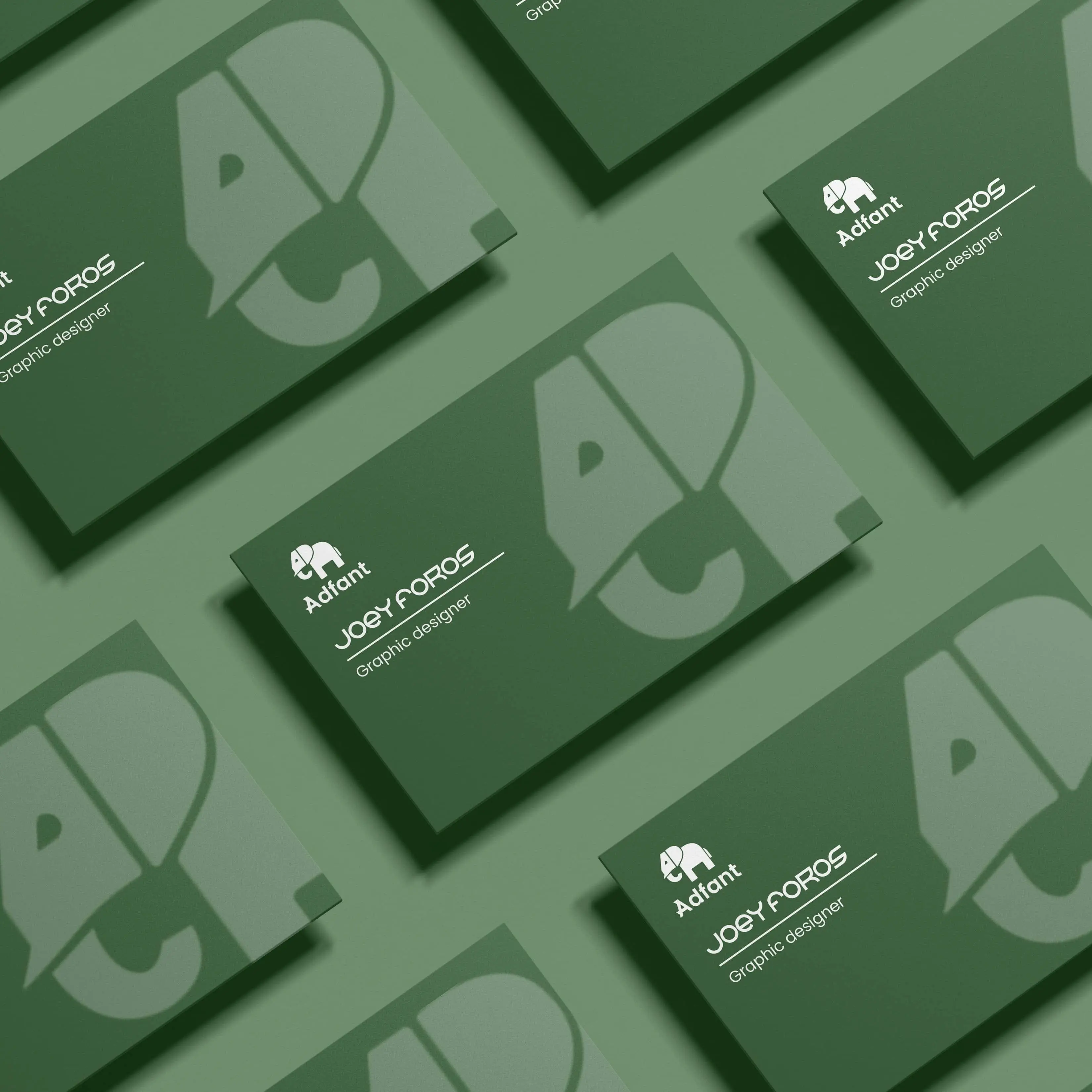
Joey Foros
Strategic Brand Designer & Art Director based in Douala.
I help brands turn their business goals into impactful visual experiences, creating identities and campaigns that stand out.
The Designer
Douala, Cameroon
I’m Joey Foros. I’m fascinated by the place where technology meets emotion, and I enjoy creating visual systems that help businesses communicate and solve real problems.
I work closely with brands that want to grow and evolve, exploring ideas, experimenting with visuals, and finding solutions that actually make a difference. My goal is simple: to help companies express who they are and where they’re going.
Capabilities
Branding
I design comprehensive brand systems, including logos, typography, and color palettes that help brands communicate clearly and stand out.
GET THIS SERVICESocial Media Design
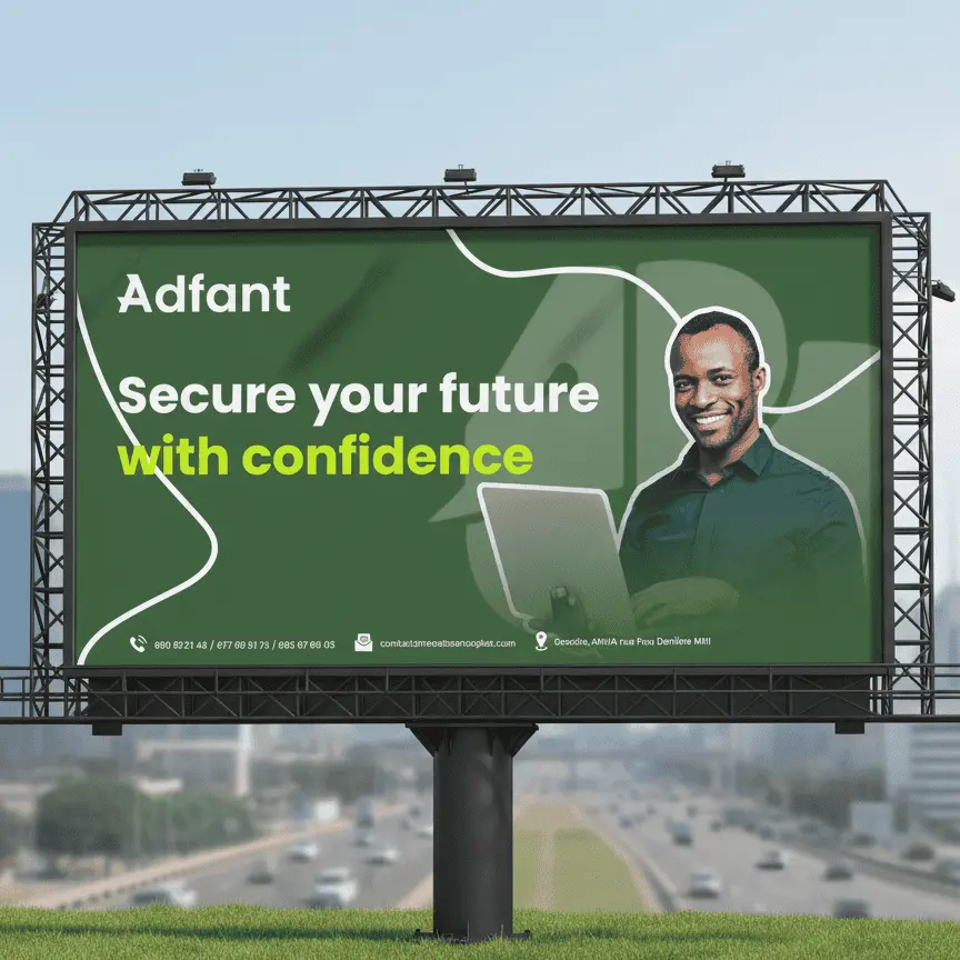
I create high-conversion assets for Instagram, LinkedIn, and Facebook, helping brands engage their audience and get measurable results.
GET THIS SERVICEPoster Design
I craft striking visuals for events, advertising, and artistic projects, bringing ideas to life and capturing attention.
GET THIS SERVICEArt Direction
I guide the overall visual tone, from photoshoots to full campaign rollouts, ensuring consistency and impact across all touchpoints.
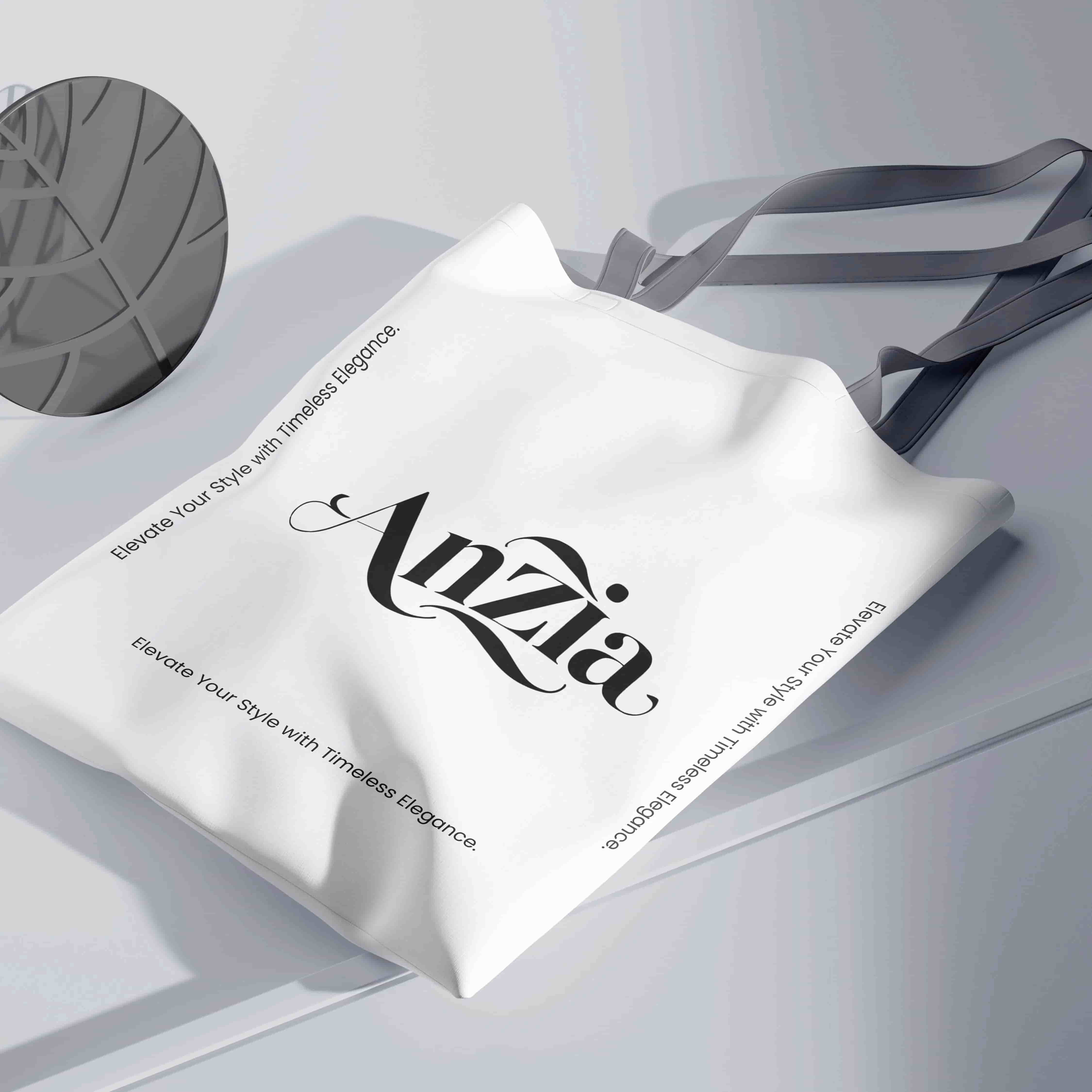
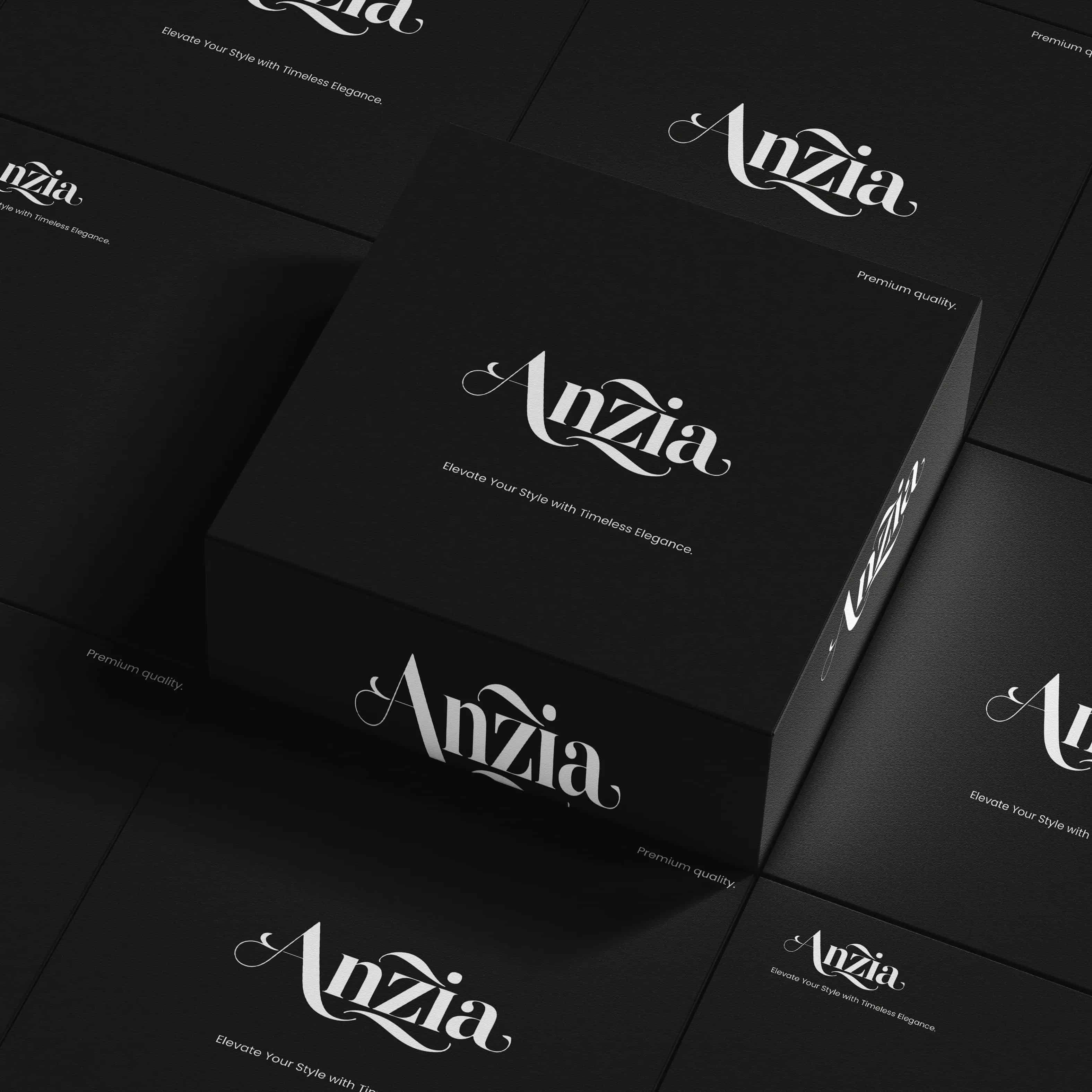
GET THIS SERVICEMy Featured projects
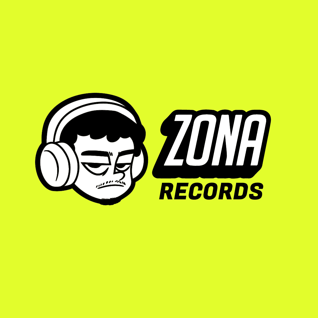
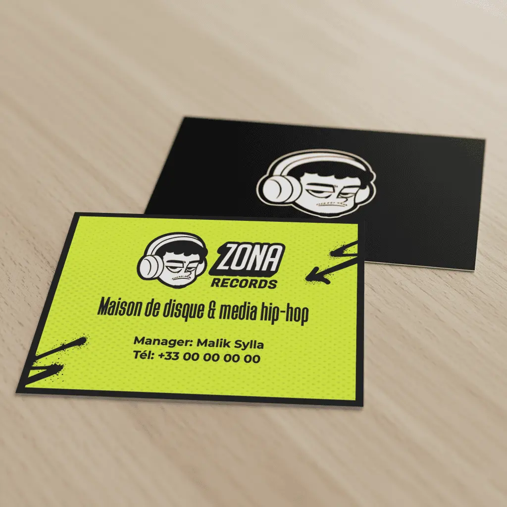
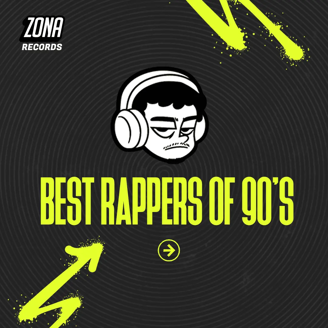
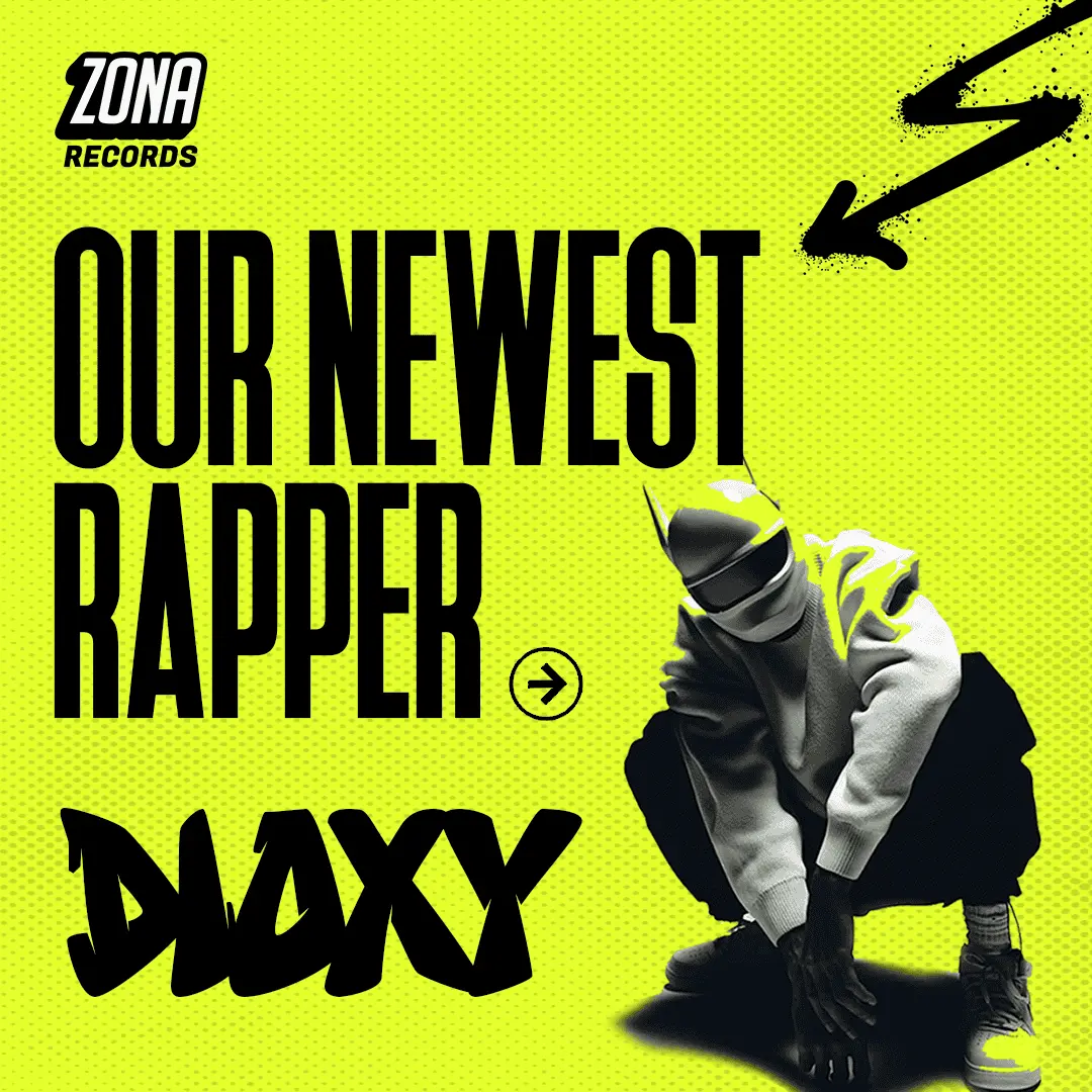
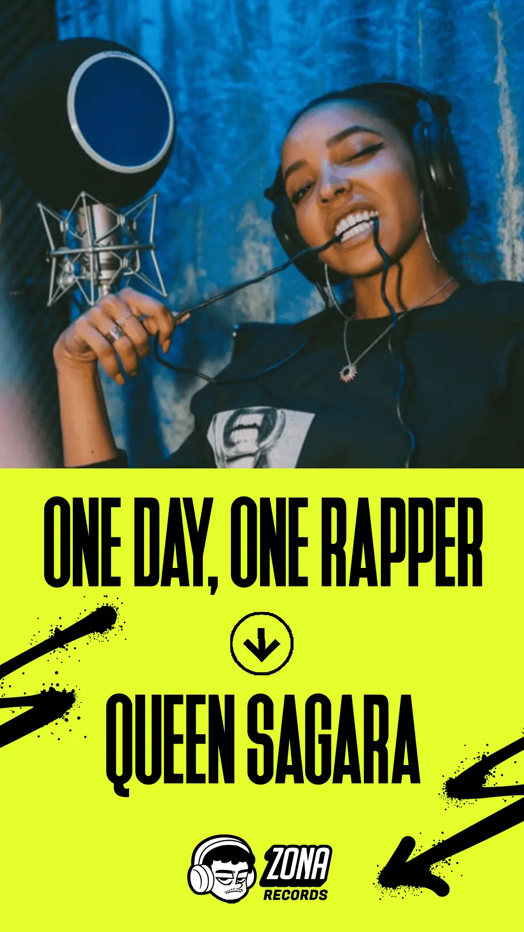
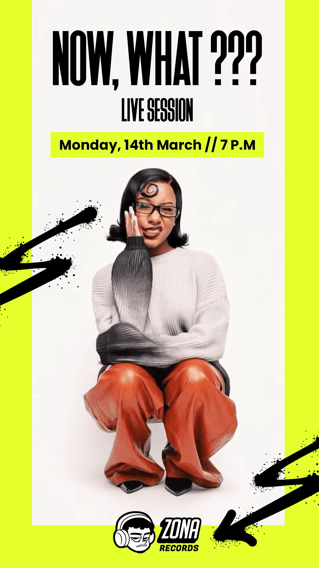
Zona
Media & Culture
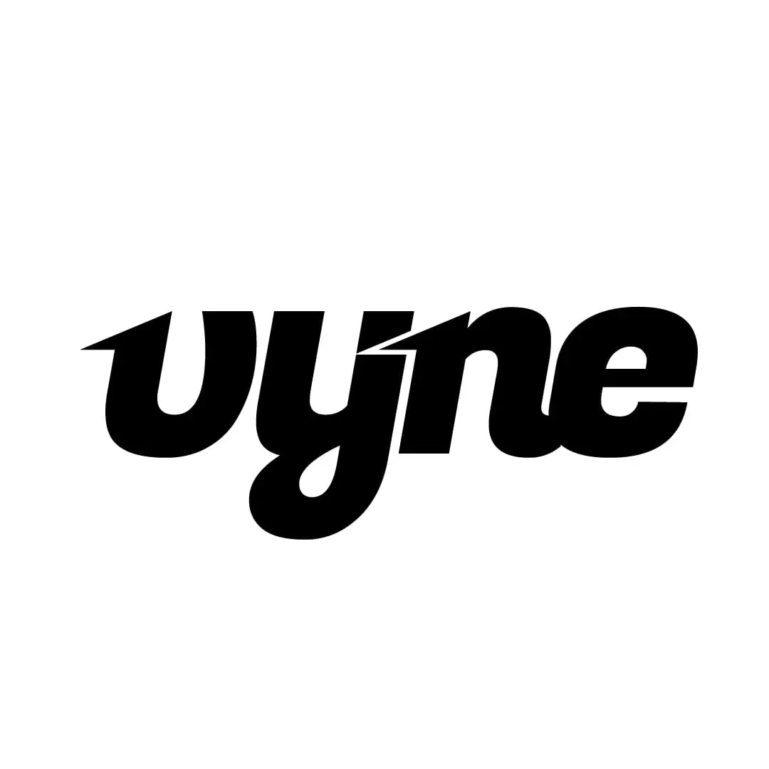
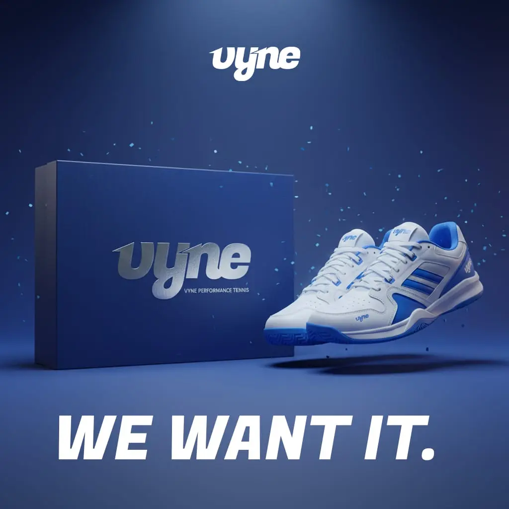
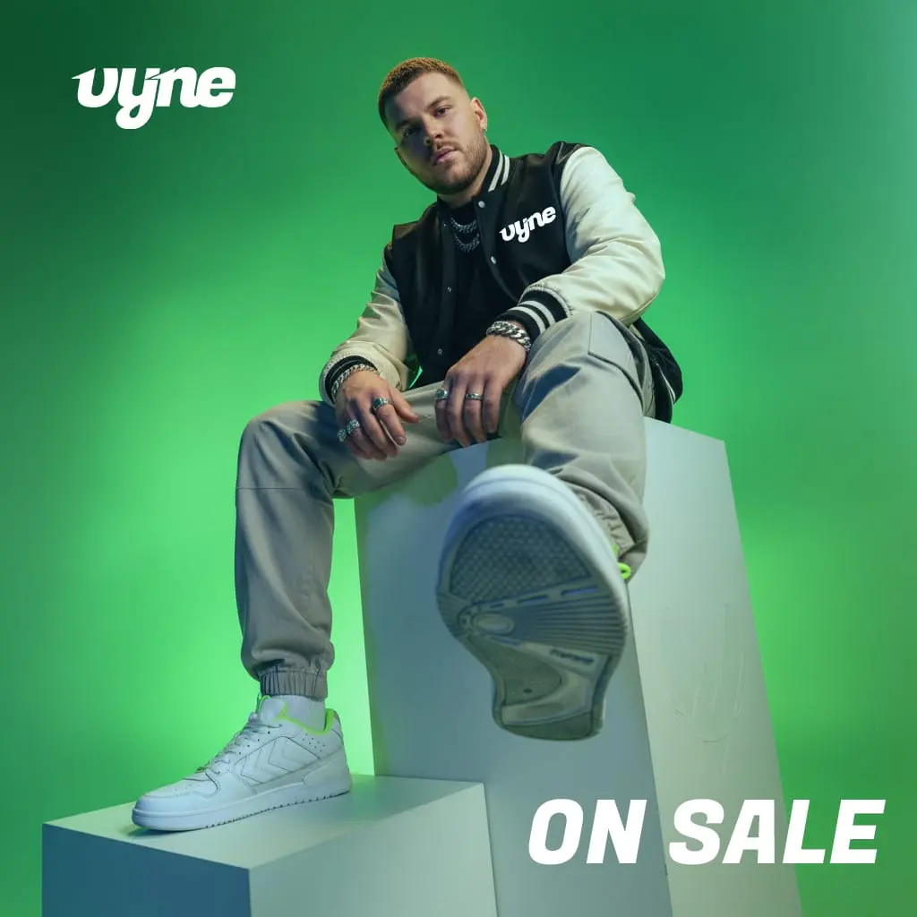
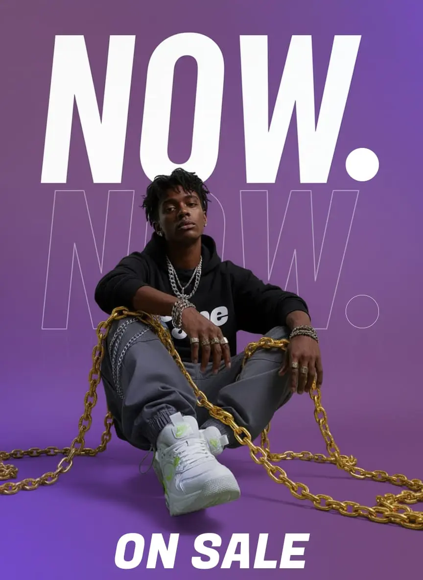
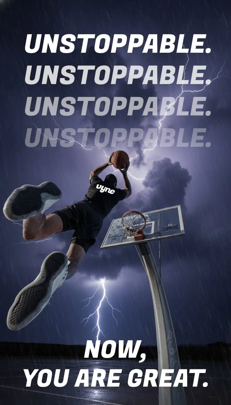
Vyne
Athletics
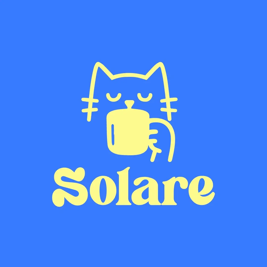
Solare
Coffee House
Others works
A showcase of my other work, including poster designs, social media campaigns, logo collections, and print projects.
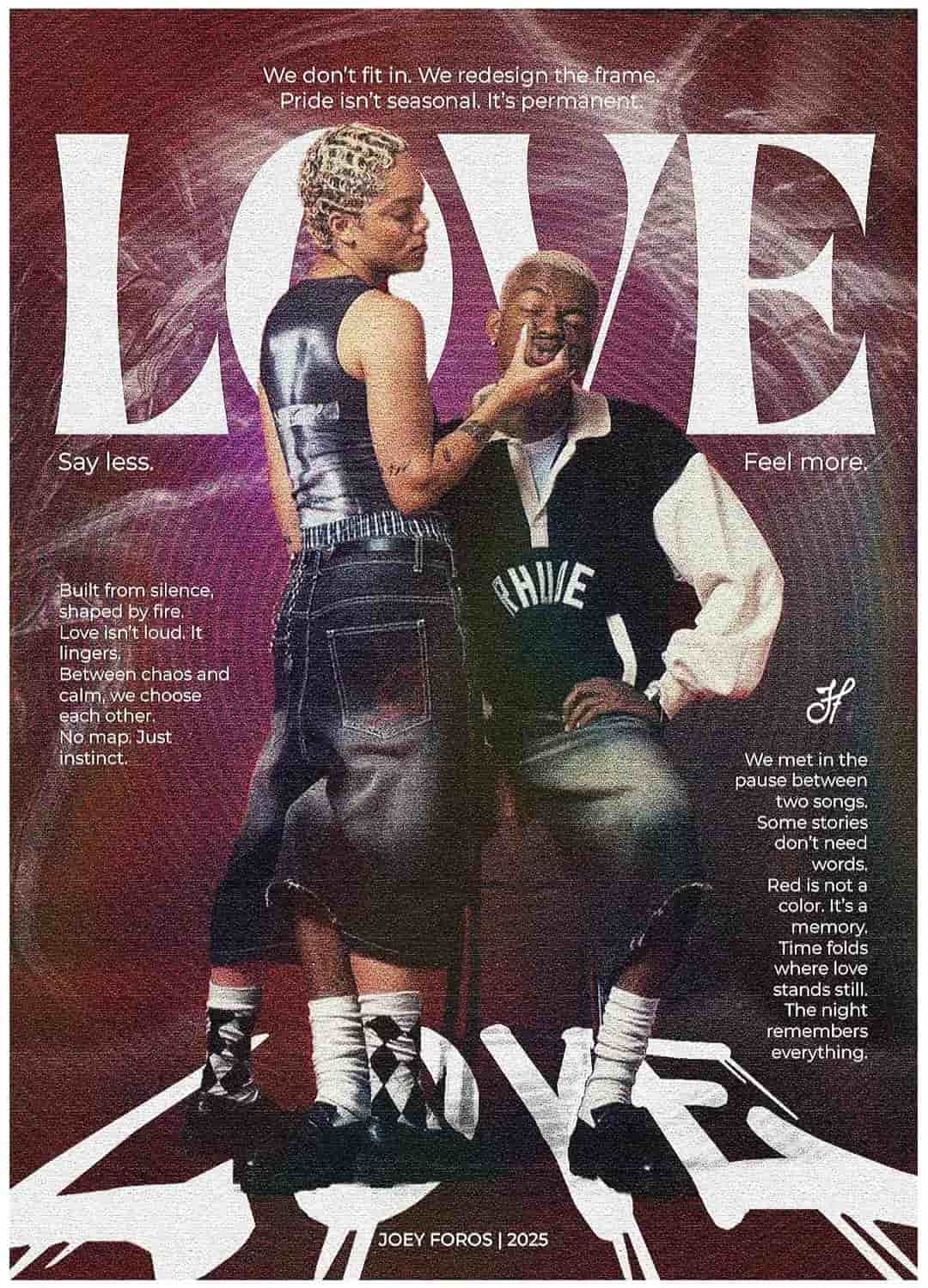
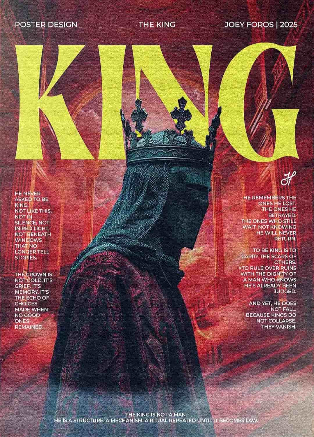
Posters
Design
01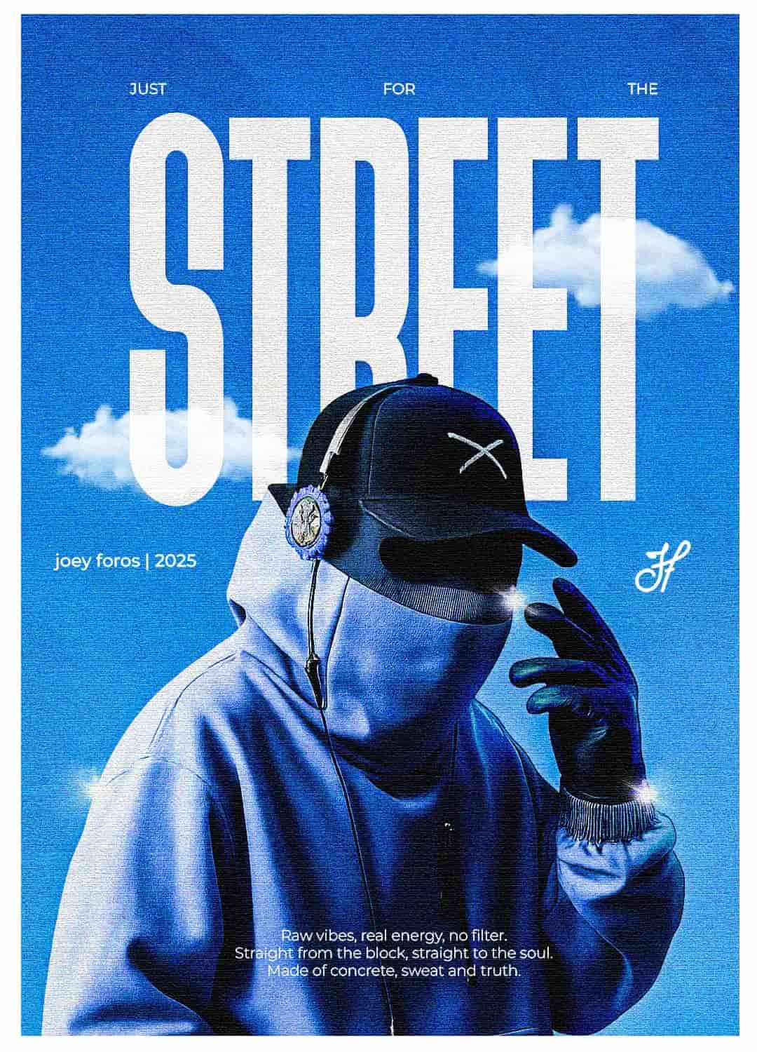
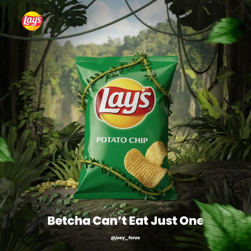
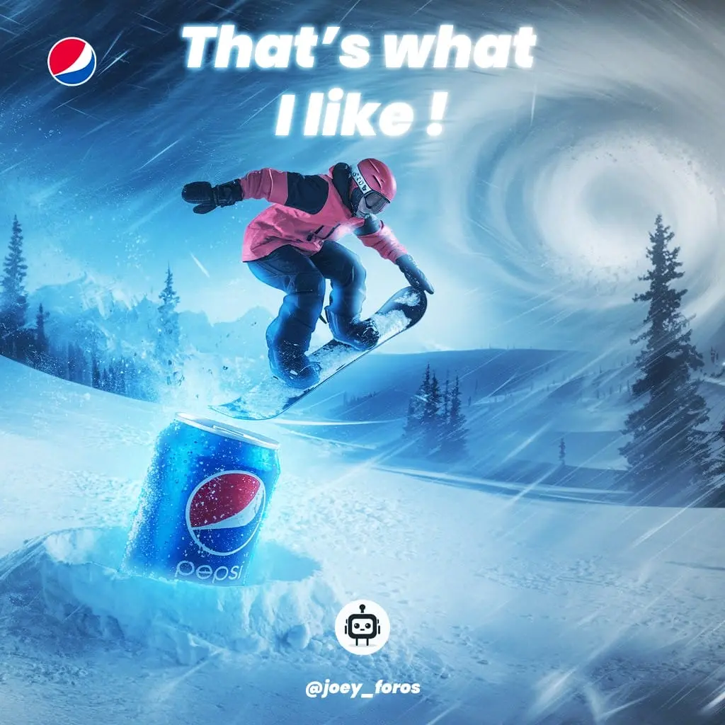
Social
Media
02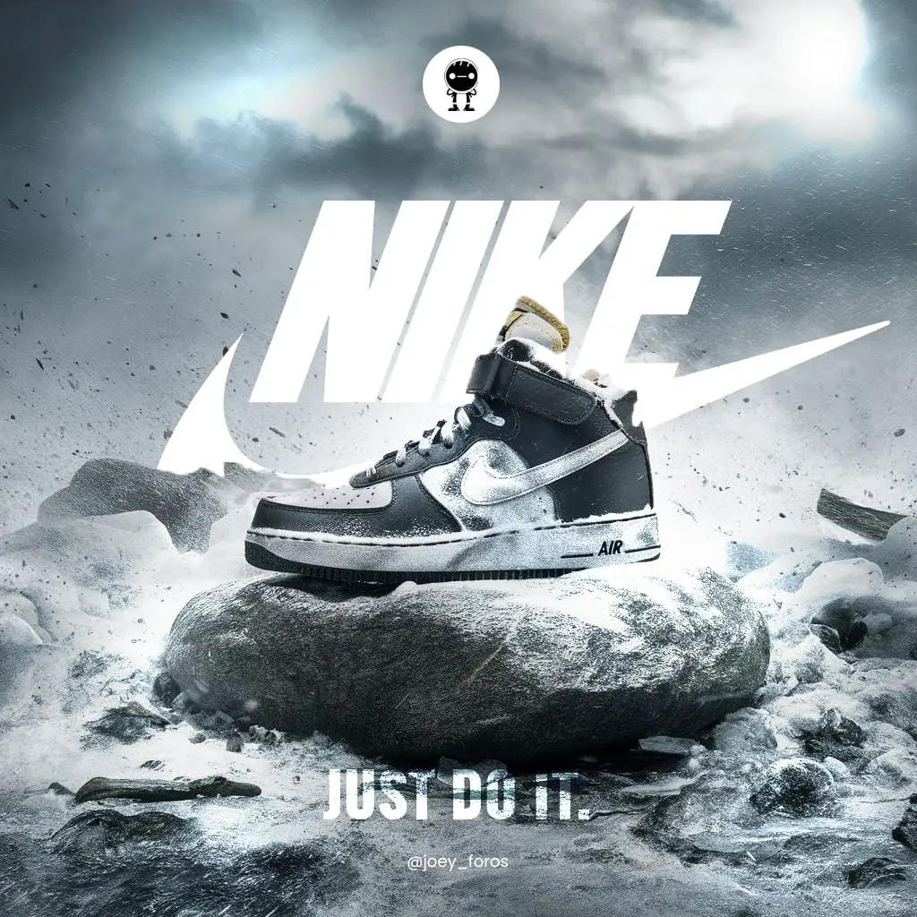
Logo
Folio
03
Print
& Edit
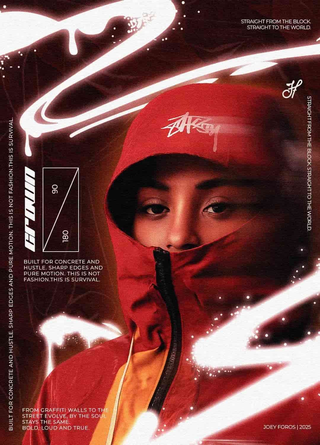
04Rap & RnB Media
Build a bold and streetwear inspired visual identity that stands out from the usual trends while staying easily recognizable.
Complete visual identity from the logo to the graphic system.
Underground
Culture.
The creative direction started with an exploration of streetwear visual codes: bold typography, sharp contrasts, and minimal compositions inspired by underground culture.
I wanted the identity to speak to a young, expressive audience while keeping a professional and recognizable aesthetic. The lime green color was chosen for its high energy and visibility, balancing perfectly with black to bring a modern yet raw visual feel.
/ Design Specifications
Vitality
The lime green accent was used to represent vitality and creativity within the urban space.
Authority
The black base reinforces authority and contrast, grounding the vibrant accents.
Urban Feel
The logo spacing was slightly tightened to give it a denser, more urban feel.
Rhythm
Typography shapes subtly evoke sound waves, connecting the visual back to music.
Project Gallery
"A bold and authentic identity that visually resonates with the rap and RnB community, giving Zona Records a signature streetwear personality."
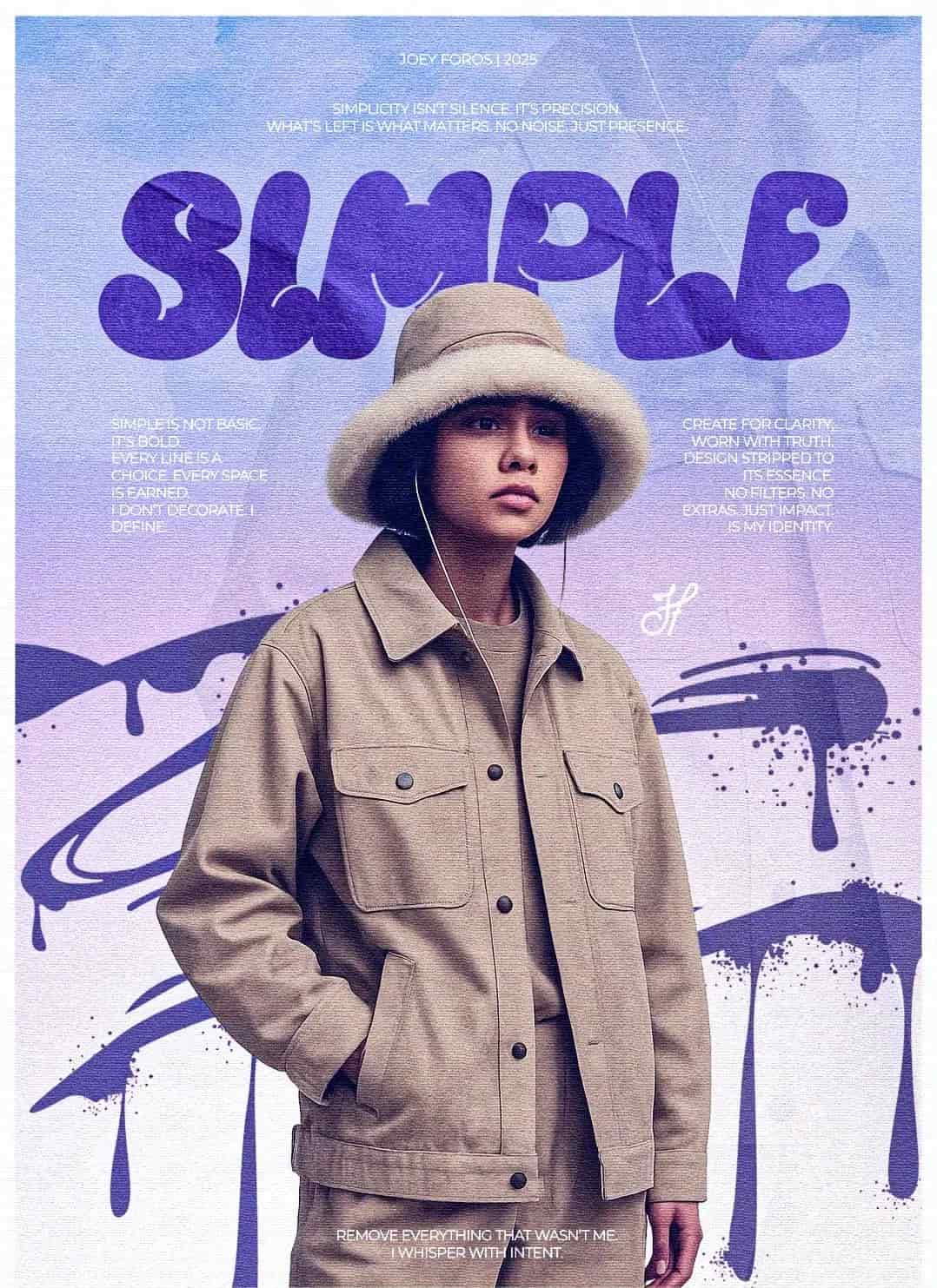
Start a Project like thisStreetwear & Sports
Build a powerful brand image that reflects strength and high perceived value within the streetwear culture.
Logo design and a promotional visual series to enhance brand identity and awareness.
Power &
Motion.
For Vyne, I wanted to merge the spirit of streetwear with athletic confidence. The process began with a study of strong, geometric shapes often found in sports branding.
I leaned towards darker tones to convey power, ambition, and exclusivity—an identity that feels premium yet approachable.
/ Design Specifications
Precision
The logo was built with sharp angles to express precision and discipline in movement.
Depth
The dark palette was enriched with subtle gradients to add texture and visual depth.
Momentum
Promotional visuals used shadows and focused light to suggest power and momentum.
Structure
Repetition and symmetry in layout reinforced the idea of control and structure.
Project Gallery
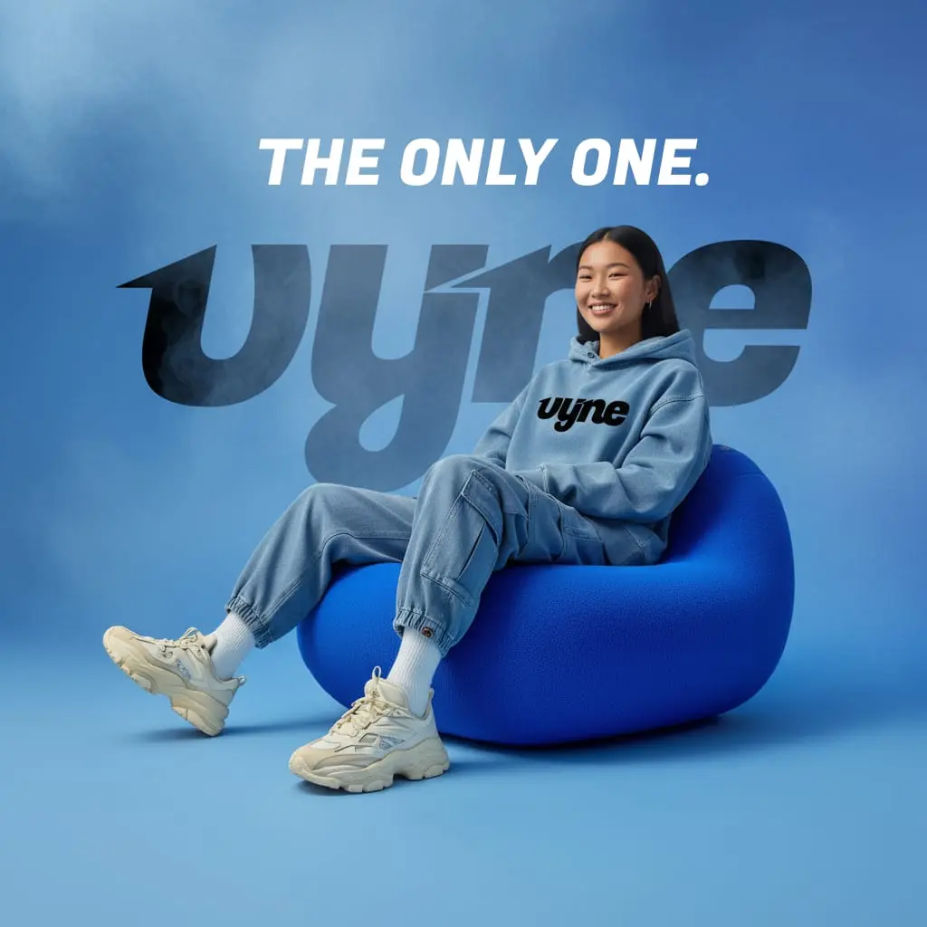
"An impactful, performance-driven identity that translates the brand’s energy into every piece of visual communication."
Start a Project like thisCoffee & Relaxation
Attract coffee lovers who appreciate calm atmospheres and artistic visuals, by creating a warm and inviting brand identity.
Logo design and full visual identity, including packaging concepts.
Warmth &
Light.
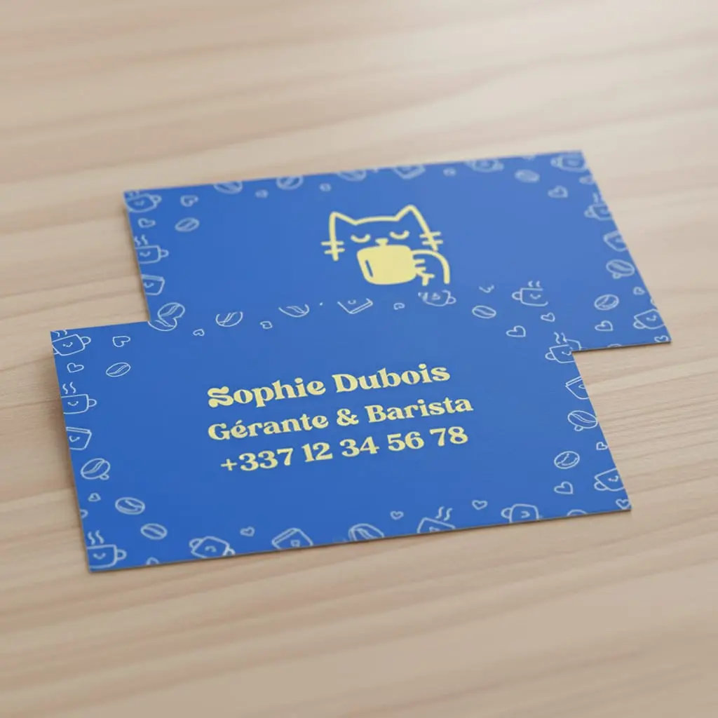
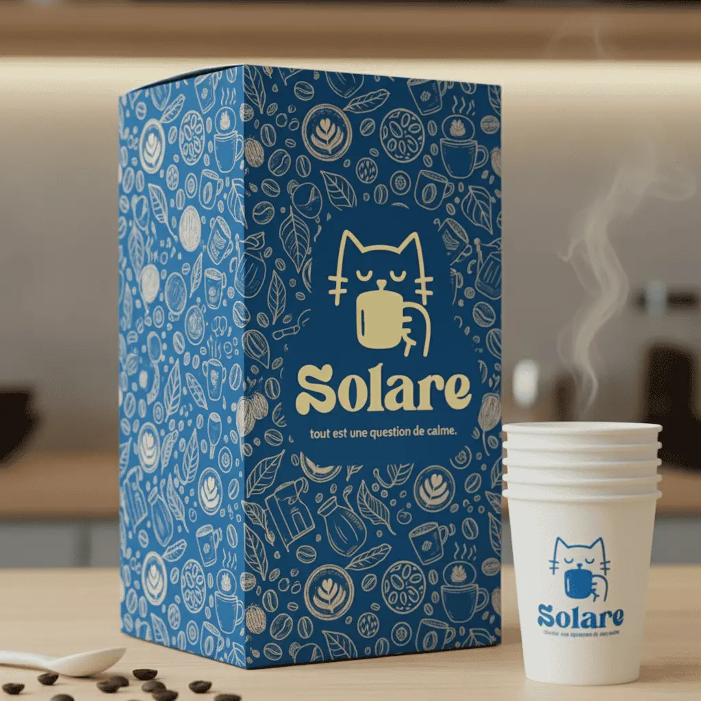
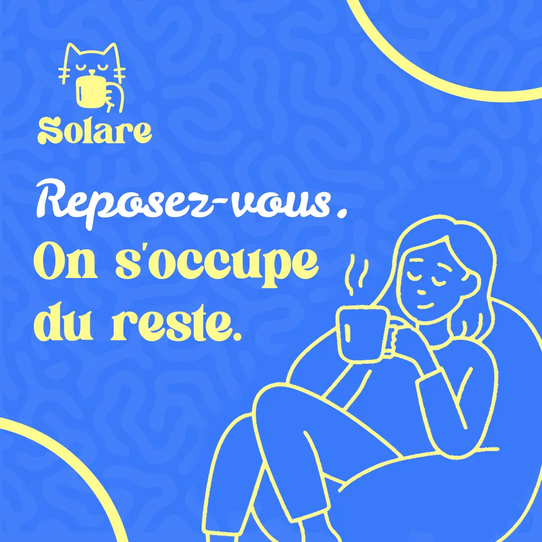
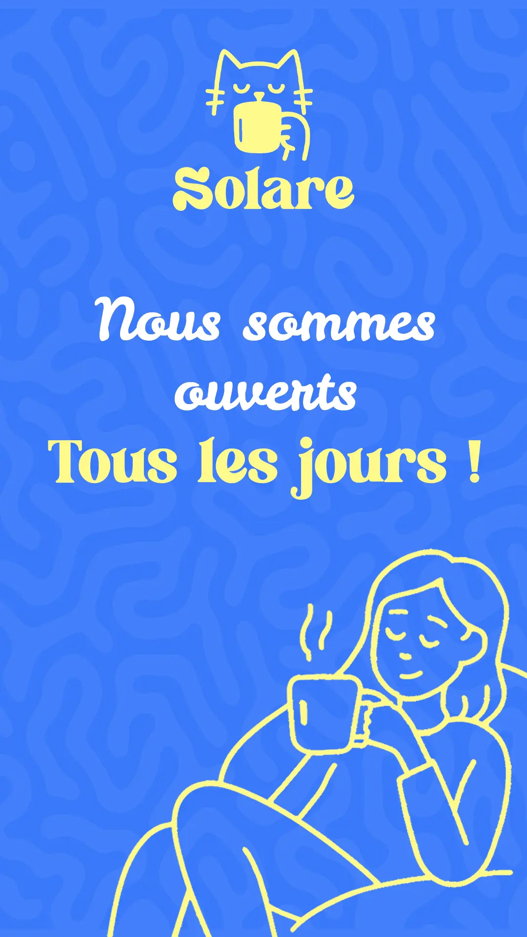
Solare’s creation process revolved around warmth, comfort, and the sensory experience of good coffee. I explored color combinations that evoke calmness and optimism—blue for serenity and yellow for sunlight.
The logo design took inspiration from minimalist illustrations, with soft lines to create a feeling of friendliness.
/ Design Specifications
Harmony
Blue and yellow were balanced in proportions to avoid visual fatigue and create harmony.
Softness
Rounded typography conveys approachability and softness, essential for a relaxation space.
Illustration
Small illustrations elements were subtly added to reinforce the brand theme.
Collectible
The packaging was designed to feel collectible and visually pleasing on shelf.
Project Gallery
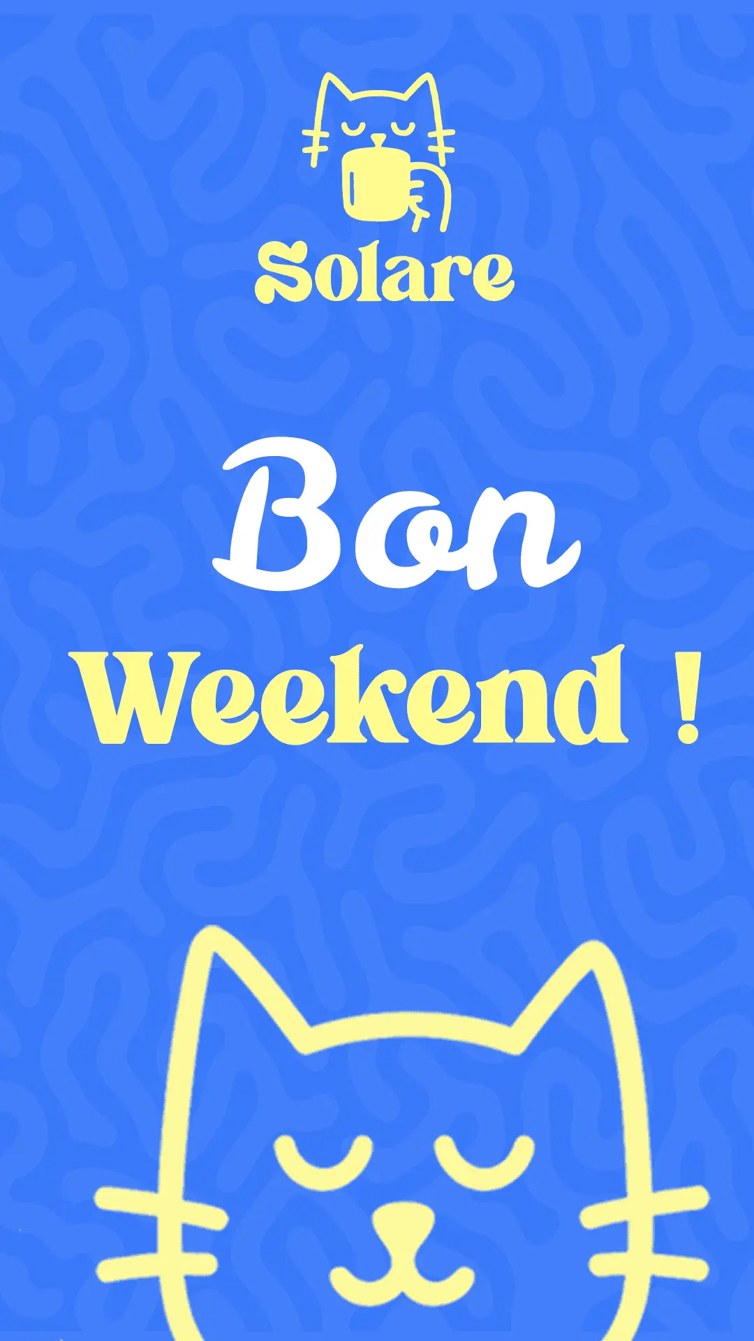
"A charming and peaceful identity that captures the essence of relaxation and creativity—perfectly aligned with Solare’s atmosphere."
Start a Project like thisVisual Concepts.
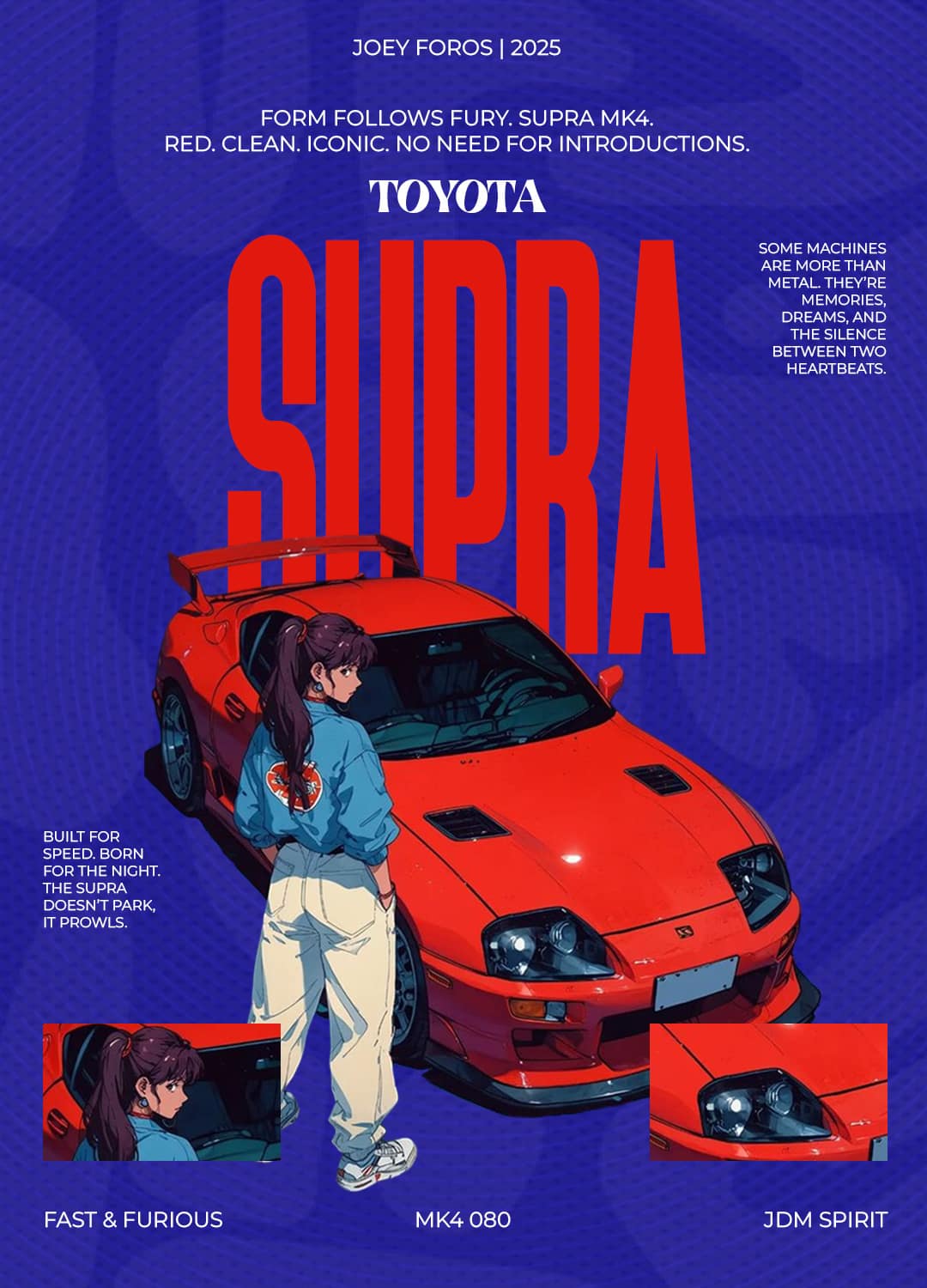
A collection of experimental and commissioned poster art, showcasing bold ideas, creative exploration, and designs that capture attention.
Digital Presence.
Engaging visuals tailored for the scroll economy, designed to capture attention, drive interaction, and make brands stand out on social media.

The Marks.
Distinctive symbols crafted for clarity and impact, designed to make brands instantly recognizable and communicate their identity with confidence.

Let's create something legendary.
Based in Douala. Working with ambitious brands worldwide.